
The Valentine Heart: A Design Worth Waiting For
- Shannon Cyr

- Feb 19
- 5 min read
Updated: Jul 27
The story behind Mainely Cards’ first Valentine’s heart — from fragile prototype to finished paper design in Metallic Red and Passion Pink.
Studio Note: This post documents an exploration from my design process. The artwork shown represents prototypes and works in progress. Some designs eventually become Mainely Cards designs. Others remain studio experiments and are never released.
Valentine's Day is one of the busiest card-sending holidays of the year. As children, many of us carefully separated perforated classroom valentines, decorated shoebox "mailboxes," and came home with a stack of cards from classmates. As adults, the traditions change, but the cards remain. We exchange them with romantic partners, friends, teachers, family members, and sometimes even our pets. It's one of the many ways we mark the day.
And yet, Mainely Cards doesn’t have a Valentine’s Day card.
The Tension
In January, Valentine’s Day was still six weeks away. Under normal circumstances, that would be more than enough time to illustrate, prototype, and build a small seasonal card set. At the time, I was building the first Mainely Cards collection.
Right now, I’m building the core catalog, finalizing the first cards, sourcing cardstock, defining brand standards, setting up packaging and shipping, and building the website and online shop. With so many foundational pieces still in motion, there wasn’t a realistic path to releasing a seasonal card in time.
Seasonal releases matter in this industry. Valentine’s Day is the second largest card‑sending holiday of the year. I knew I couldn’t produce a card for this season, and I wasn’t trying to push one into the lineup. Even so, the idea lingered. It kept finding its way back into my thoughts while I was focused on other parts of the business. I returned to it in the quiet moments, sketching and doodling even though I knew it wouldn’t make it to market this year. In the end, it became something I worked on in my spare time, outside my roadmap commitments, simply because I didn’t have the heart to let it go. ;)
The First Attempt
In early January, I created a heart design made up of multiple geometric sections. The goal was to build a heart card using layers of paper: three shades of red and pink forming the interior, cut to fit together like a puzzle, with a top layer that would create the separation between each section.
I loved the design. The heart felt balanced and strong with just a bit of interest in the coloring. It looked like it would be quick and easy to assemble: 3 shades of red with strategic cuts, layer the colors, add the outline, and the card would be done.

Then I cut it in paper.
Disaster.
The thin outline ripped. First in black cardstock, then in black glitter, red glitter, and red foil. I adjusted settings. I swapped blades. Nothing worked. The lines were simply too fragile. Tiny points collapsed and edges frayed just enough to ruin what had looked precise on screen. That lesson stayed with me and influenced later designs, including the Blue Lobster prototype.
Not to be deterred, I removed the outline. I kept the interior sections and let the edges define the negative space. No such luck. Without the overlay, the heart lost its sharpness. The structure that had felt so strong digitally couldn’t hold in paper.
After investing half a day on the heart, I shut it down. Mostly. I shut down this specific heart design, but I didn’t shut down the ideas. When I needed a context switch, I’d drop Valentine’s concepts on my whiteboard and keep moving.
By February 10th, I was feeling the pressure. Valentine’s Day was four days away. I knew it was impossible to launch in time, but the cognitive dissonance was real.
The Lobster Detour
I made a panic move.
I grabbed a stack of half-cut foil lobsters from a recent cutting mishap. Earlier that week, I had too many lobsters queued up and not enough foil paper on the mat. I misaligned the sheet and didn’t catch it before cutting. The result was a stack of perfectly clean half-lobsters. Being frugal, I keep anything that might be usable.
Looking at them, I thought, I can turn this into a Valentine’s set. Because, sure, nothing says love like a live Maine lobster.
I sketched out a small set inspired by old-fashioned Valentine exchange cards. Clean layouts. A heart. Something I could create in a few hours. The phrases came quickly:
You're a Keeper
Caught Feelings
You're a Catch
Hooked on You
For Keeps
From Maine, With Love
So, I made one.

It was cute. And a little weird.
Mike gave it a sideways glance. That was enough.
We have a simple studio rule: if both of us don’t love a design, we don’t pursue it. If there’s hesitation from either side, we trust it and move on.
So I went back to work.
A Gift of the Heart
After Valentine’s Day, the cards came up in conversation. I admitted it was still bothering me not to have one in the Mainely Cards catalog. Michael suggested revisiting the heart and trying the design again. Then he gave me the best Valentine’s Day gift possible: time and space in the studio to create it.
How I Approached It
My first segmented paper design used a more geometric shape with sharp intersections. For the final version, I chose fluid lines that complemented each other and flowed instead of creating a geometric puzzle. I treated the heart silhouette as the primary anchor and used negative space to strengthen it, not fragment it.
What I Designed
A heart with movement. Curves sweep across the form rather than fracture it, preserving the silhouette. The negative space is deliberate and measured, functioning as structure, not decoration. The eye moves freely through the design. Even in parts, the heart holds together.

It’s the balance I was craving: structure without stiffness, energy without disorder — a heart unified by its own form rather than fractured by it.
What I Created
I started with Metallic Red no-shed glitter, one of my favorite papers to work with. It cuts cleanly, holds crisp edges, and catches the light without overpowering the design. I’ve tested other red glitters, but this is the one I reach for. I love this paper, and this was the right place to use it.
I created the Valentine’s heart cards in two sizes: A7 (5 in x 7 in) and A2 (4.25 in x 5.5 in). Both designs lifted off the mat perfectly on the first run. No tearing. No frayed edges. Every piece aligned exactly as planned.
These cards were a joy to create. The build had a rhythm to it. Weed. Glue. Place. Adjust. Press. Repeat. I could stay in that flow for hours. In fact, I did.
The result was twelve A2 notecards, evenly split between Passionate Pink and Metallic Red, and a single A7 Metallic Red greeting card.
Valentine's Heart Cards

Let's Get to the Heart of It
Building something new requires patience and discipline. There was a false start, a detour involving lobsters, a redesign, and eventually a heart that finally worked.
The finished prototype cards met our quality standards and were donated to Wicked Good Cards. Although they never became Mainely Cards products, they fulfilled another purpose by helping people connect in Maine care communities.
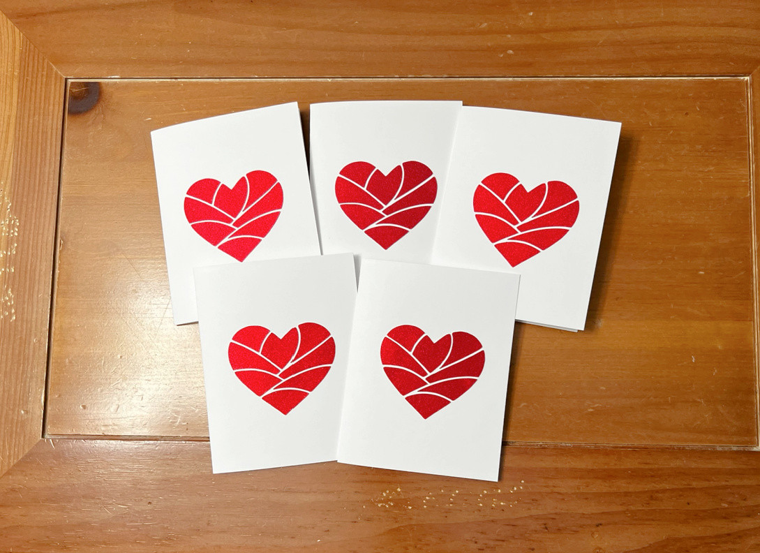

The heart design itself remains part of my studio archive. Whether I revisit it in the future or leave it as a snapshot of this stage in my creative journey, I'm glad I followed the idea to the end.
Mainely Yours,
Shannon


