
The Sunny Egg: Choosing the Right Design
- Shannon Cyr

- Apr 2
- 5 min read
Updated: Jul 27
A look inside the studio as a simple Easter egg design takes shape—from early testing to a finished card that’s easy to build and holds together.
Studio Note: This post documents an exploration from my design process. The artwork shown represents prototypes and works in progress. Some designs eventually become Mainely Cards. Others remain studio experiments and are never released.
Recently, Michael and I spent an afternoon in the studio testing a new design. My goal was to create a paper egg that was straightforward to produce, forgiving to assemble, and not overloaded with small pieces. I had four potential designs ready to test.
But First, Names
When we're working on a new design, there’s a lot of trial and error early on. It's hard to know how a shape will render in paper until you try it. Different types of papers, the color, and machine settings change the output, so there’s always a bit of discovery involved. Designs I’m sure I will love fall flat, and ideas that seem ridiculous end up landing. I love this part.
It’s during this experimental phase that names start to emerge. Describing designs by shape—“the one with the five loopy wavy lines”—gets old fast, so I give the design a name that makes me smile.
As I brainstormed ideas, I added two constraints: each name had to sound like a real person's name and somehow tie into eggs without being obvious or overly cute.
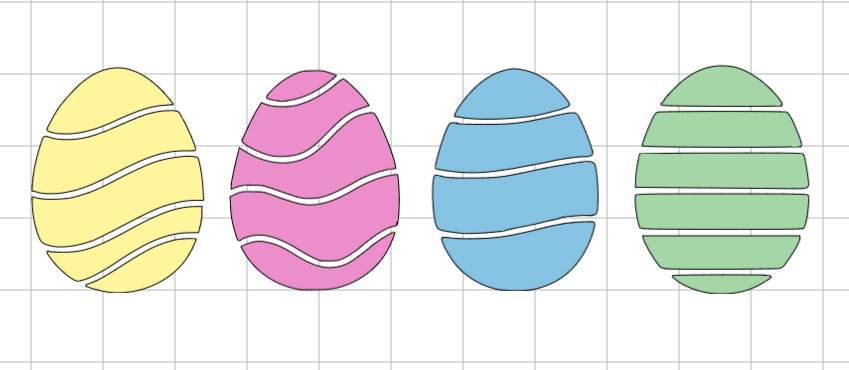
I started with the first egg on the left. That one was the easiest to name. I colored it yellow and it reminded me of the sun. Sunny.
The next egg had lines that were softer. After I made it pink, the name came quickly: Shelly.
The third egg took a little more thought. I used blue and thought Benedict, like Eggs Benedict. Maybe Ben? I considered Ned, but my brain immediately went to Ned Stark. Once that thought entered my mind, it couldn't be undone. Nope to Ned. I chose Benny to keep the naming consistent with Sunny and Shelly.
The final striped egg was the hardest to name. By this point, all the names ended in “y.” It wasn’t planned, but it stuck. I considered Peggy (p-eggy), but I didn’t want another feminine name. I was looking for something more neutral that still worked with the theme.
Easier said than done.
Not wanting to fall further down the rabbit hole, I expanded options beyond egg dishes into a broader kitchen theme. That’s when Remy came to mind. It stuck.
Easter Egg Designs, from Screen to Paper
I introduced Michael to the designs and when I explained their names, I got a classic dad-joke eye roll. Success.
Going into our session, the plan was simple: choose one design, cut it in a few different colors of paper, and start mixing and matching paper layers on cards. We used classic Easter colors—pastel pink, blue, yellow, purple, and green—and chose yellow for the first cut.

Three of the four designs had similar wavy line patterns, so we picked the outlier: the Remy Egg design.

The moment we saw it, we knew it wasn’t going to work. It looked tedious. Too many lines. Too much perfection needed. It didn’t look like it would be fun to put together.
We went back to the designs and looked at the three curved options again. The Benny Egg had the fewest segments; simple and easy to assemble. The Shelly Egg went in the other direction with more pieces and detail; the top of the egg is a smaller piece, and I could already see the chance to misalign the next layer.
The Sunny Egg was the Goldilocks. It had more movement than the Remy Egg without feeling tedious, a little more going on than the Benny Egg, and it doesn't reach the same level of complexity as the Shelly Egg.
Sunny was the one.
Sunny, So True
We started with light blue cardstock and, this time, cut six eggs at once.
It was a small risk. If we didn’t like the result, we’d have six eggs to recycle. But the payoff of six clean cuts was worth it.
Using as much of the sheet as possible in the first cut yields the best results. Paper behaves differently depending on where it sits on the mat and how often the mat is handled. When the mat is full and run once, the blade travels in longer, smoother paths and maintains more consistent pressure. Breaking it into multiple runs introduces variability—edges can lift, pieces can shift, and cuts can become less consistent.
The risk paid off. The design cut cleanly. I could see how the layers would fit together, the alignment looked forgiving, and most importantly, it looked like it would be fun to create.
After seeing it in blue, we cut the Sunny Egg design in yellow, green, pink, and purple cardstock and spread the mats out on the craft table.
Why the Sunny Egg Design Worked
With all the colored cardstock in front of us, it was clear to see how the design worked.

Each piece fits naturally into the egg’s structure. The cuts are large enough to handle with ease, and the design guides placement in a way that feels intuitive. Pulling pieces from different colors made the results visible immediately, and swapping out anything that didn’t work was simple.
What surprised me most was how approachable the design is—and how comfortably it supports different ways of creating, whether you’re building quickly or taking a more deliberate approach.
Most of all, it was just fun. Every card we made was enjoyable to create.


Looking at the finished cards, the design holds across every version. Each one follows the same underlying structure, but the color choices shift the overall feel. Some combinations are softer and more subtle, while others feel brighter and more energetic.
The curved shapes create a natural sense of movement, and the layered paper keeps each piece distinct. The spacing, contrast, and proportions work together so the design stays crisp without feeling busy.
Most importantly, the design is forgiving. Small differences in placement don't distract from the finished card, making it enjoyable to assemble whether you're working quickly or taking your time.
A Different Path
The Sunny Egg did exactly what I hoped it would do. It was enjoyable to build, forgiving to assemble, and held together beautifully across different color combinations.
As the Mainely Cards collection evolved, Sunny found its place in the CardCrafting Kit™ collection, where the design was a better fit than it was as a greeting card.
Sharing the Sunny Eggs
We finished the afternoon with fifteen Sunny Egg cards, all donated to Wicked Good Cards. It felt right that a design born from such an easy, playful studio session would go on to brighten someone else’s day.
If you’d like to see the full donation details, you can read more below.

Mainely Yours,
Shannon


